THE ‘R’ APID GRAPHER: RAPID GRAPHING OF MEANS AND STANDARD ERRORS, OH YEAH!
So there are a bunch of situations where you just want to quickly look, graphically, at the means and standard errors of groups for a variable or set of variables. Although there are some awesome functions like ddply() in the “plyr” package you may still require some data processing before actually plotting things. A good friend Diego and I sat down one day and came up with a neat little function which can do this by simply just plugging in your data, making use of functions in a couple of other packages. Here is how its works:
First we want to simulate a fake dataset:
mat <- data.frame(LABEL=rep(letters[1:5], each=7), C1=round(rnorm(35, mean=50, sd=15)),C2=round(rnorm(35, mean=50, sd=15)),C3=round(rnorm(35, mean=50, sd=15)),C4=round(rnorm(35, mean=50, sd=15)),C5=round(rnorm(35, mean=50, sd=15)))
This gives us a simple data set with one factor variable (LABEL) with a series of other “measured variables” which we are interested in knowing the mean and se for in each of the factor levels (C1-C4)
Here is what part of the data looks like:
mat
LABEL C1 C2 C3 C4 C5
1 a 47 73 60 13 42
2 a 59 66 30 80 17
3 a 40 44 66 60 47
4 a 38 51 59 34 59
5 a 53 48 35 37 52
6 a 53 72 27 65 38
OK! So now that we have these data we are interested in a quick way to graphically plot the mean and se in each of the groups (a-e). But before we can do that we need to install a package:
install.packages(“plotrix”) ; library(plotrix)
Sweet! Now that this is in why don’t we apply a generic function which will allow us to do this with the structure of the dataset we have above that we call plotmeanse():
plotmeanse = function(x, xlab = c(“”), ylab = c(“mean”)){
x is defined as a data frame with column one representing the grouping variable
xlab is defined as the label to be placed on each axis
par(mfrow=c(round(ncol(x)/2), 2))
for(i in 2:ncol(x)){
xm <- as.vector(tapply(x[,i], x[,1], mean))
xe <- as.vector(tapply(x[,i], x[,1], std.error))
plotCI(as.numeric(unique(x[,1])), xm, xe, xlab=xlab, ylab=ylab, main=names(x)[i])
}
}
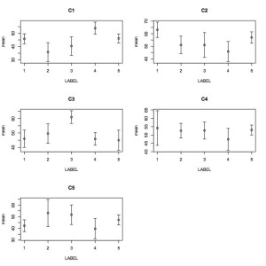
So the function is called plotmeanse() and has 3 arguments: 1) x which is your data frame, mat; 2) xlab which is the x label. If you don’t provide anything then it defaults to being blank; 3) ylab which is the y label value and defaults to mean if you don’t specify the value because the function is generating mean values within the factor levels. Now lets see how this baby works! Since we have executed the code above we can now use our function on the dataset:
plotmeanse(mat, xlab=”LABEL”)

